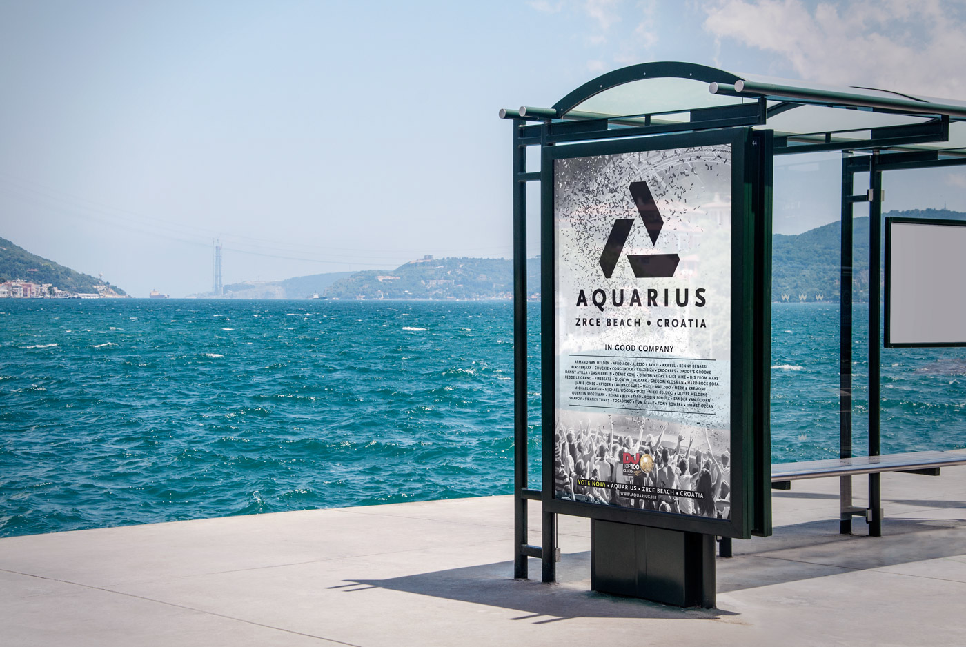
Aquarius club, Zrce beach, Croatia
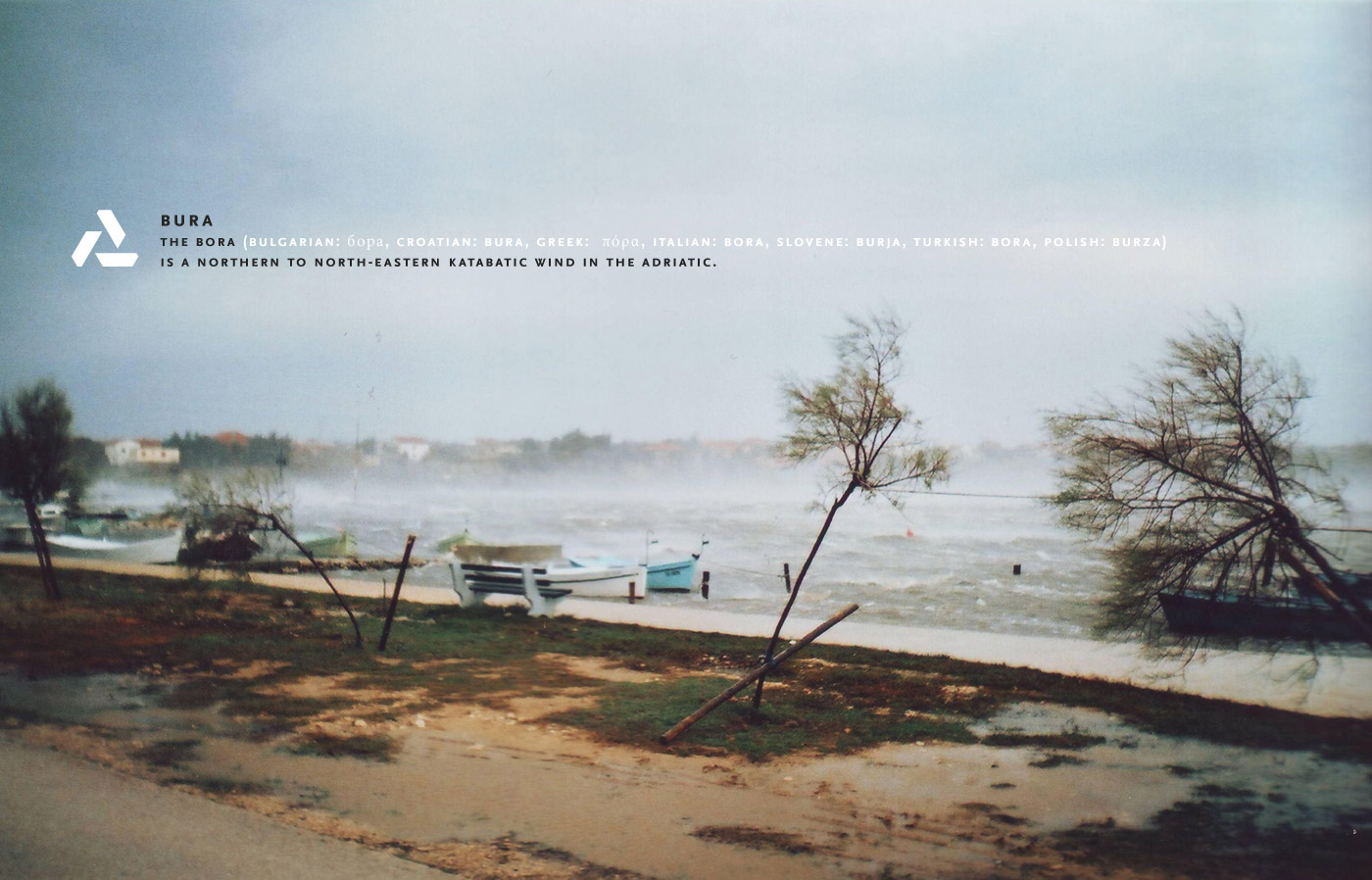
Surrounded by the Adriatic Sea, Velebit mountain and strong wind blowing from it, the idea for the new Aquarius Club logo was found in these natural elements which are the part of the island, as well as the club. Also, the logo resembles the letter A, which is the mark letter of the club, Aquarius. When you put all those elements together, you get a windmill stimulated by the strong Velebit wind. Strong, unpredictable, amazing and gracious. Just like the wind.


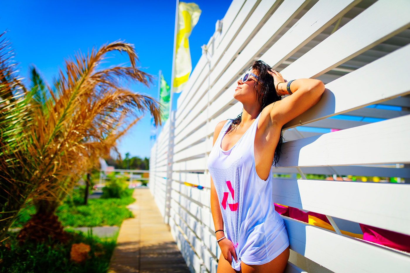
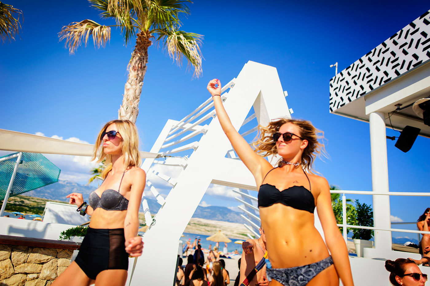
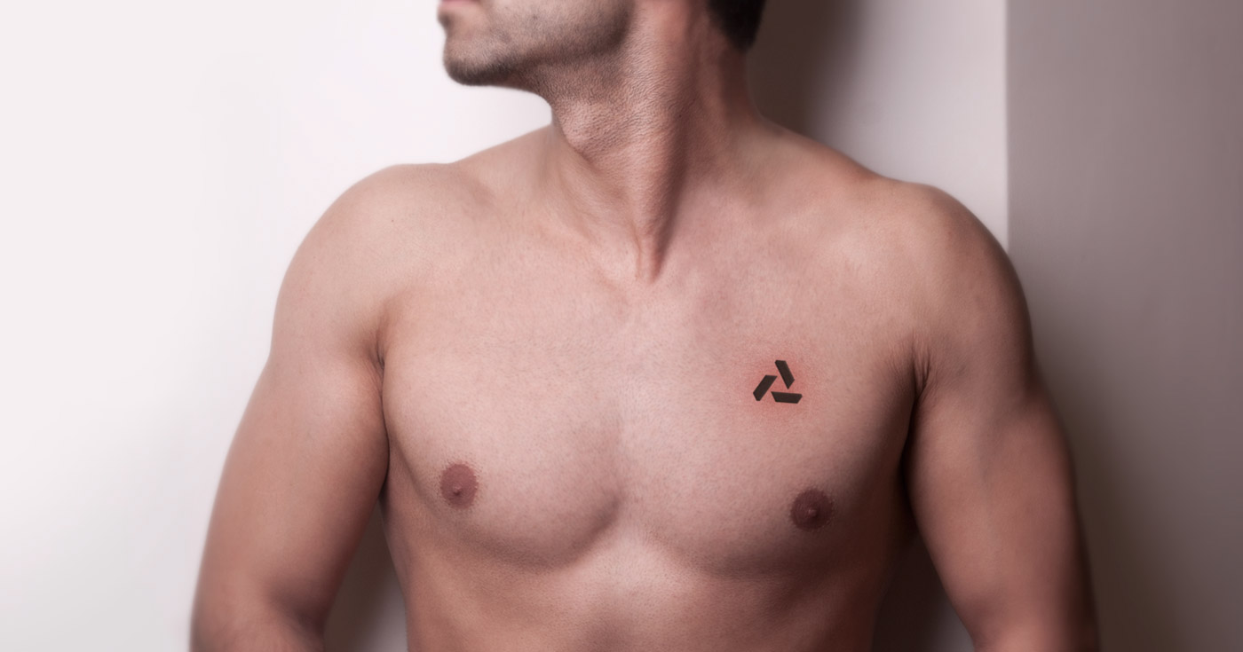
Regular clients approach
The club that never sleeps. That's the priority when it comes to our daily communication. That's the message we want to deliver. Even when the rest of the world is resting, the colors bursting from our world are tempting you to join us.


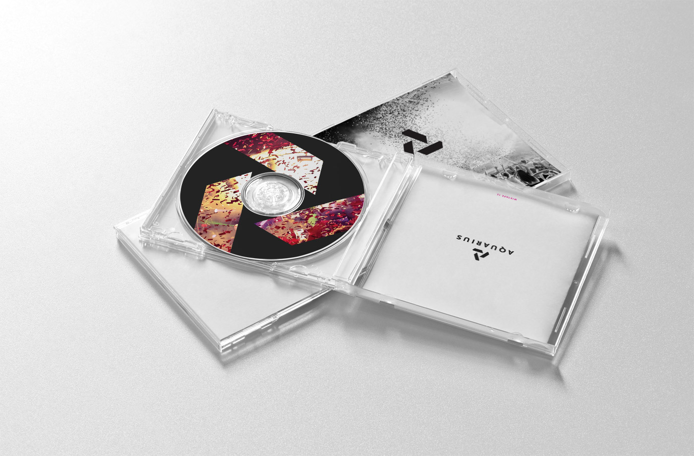
The VIP section usage
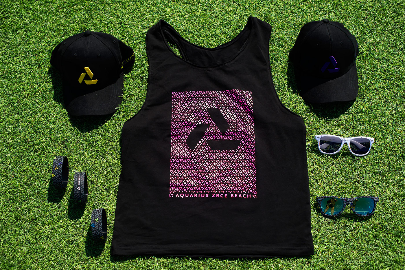
Aquarius is a beach club offering large and luxurious VIP area.
Therefore, it demands more exclusive communication with the VIP clients.
That is the mission of the logo-made pattern.
That is the mission of the logo-made pattern.


B2B usage
Simple, yet strong and clever visuals are a key to our communication and presentation towards media and business partners.

This video is not my property, but I think it might give you a pretty good idea of Bura wind in Croatia.
It was recorded at the bridge which connects the island Pag (on which is Aquarius club situated) with the coast.